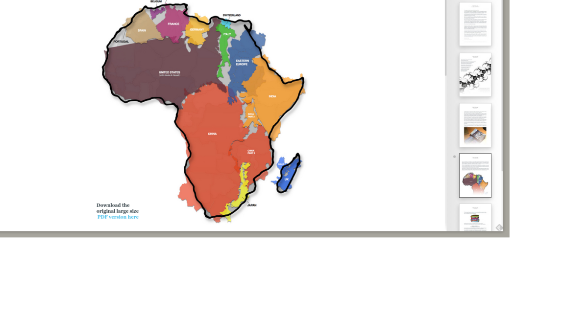
Little did you know, you’re not where you think you are — at least on the world map. When it comes to cartography, the greatest myth the mapmakers ever pulled was making us believe we’re bigger and more important than we actually are. When you see things in true perspective, you’ll probably question things a bit.
Here are the resources to help you sort out where we really fit in a true world perspective.
- This is an excellent interactive tool will help you see the true size of countries and states.
- Here’s the link to the original work the tool linked above was based on.
- Here’s a great article from Quartz that provides more background.
And here’s the social commentary provided by the writers of The West Wing.


